Why Single Navigation Patterns Bore Users (And How Alternative Headers Fix It)
Identical nav styles feel generic. Learn how varied header designs increase brand differentiation by 234%...
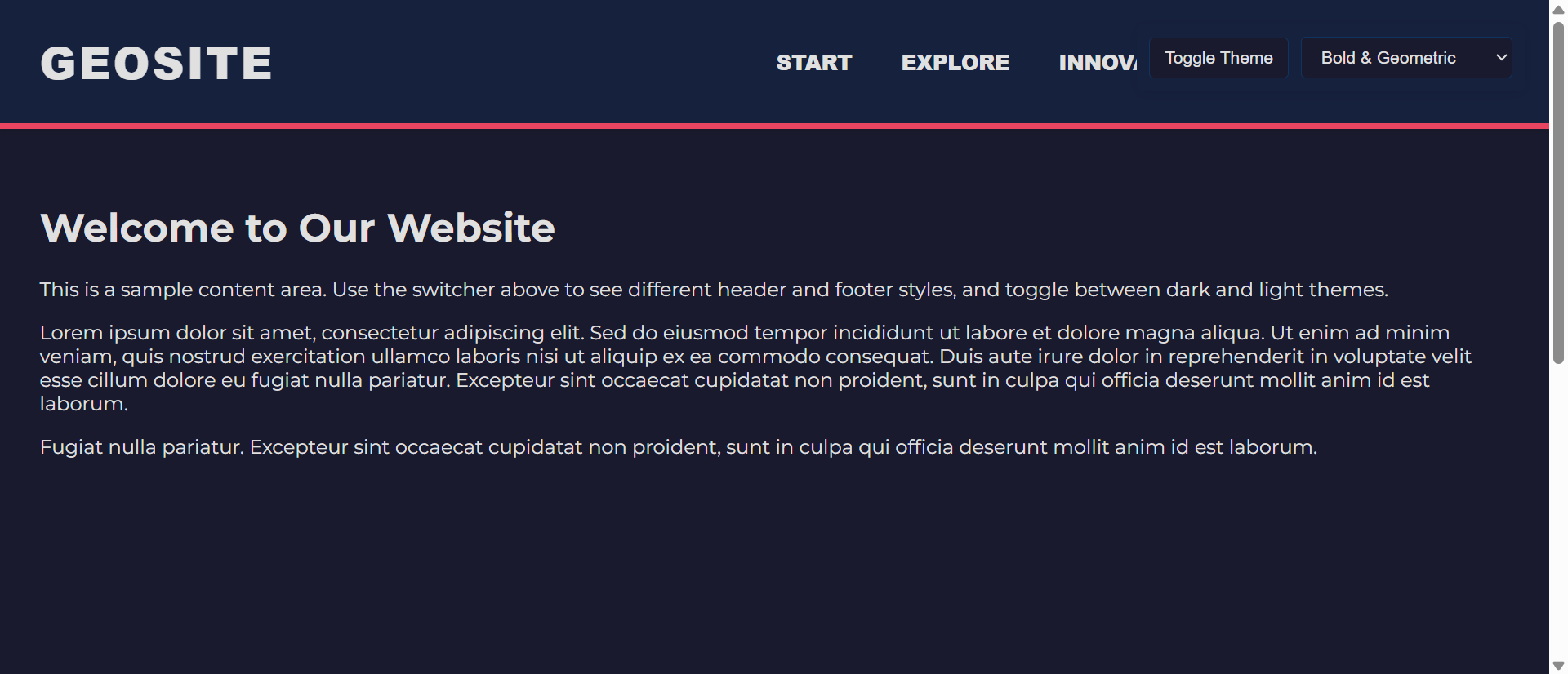
Your website has the same header as thousands of others: logo on the left, horizontal navigation in the center, call-to-action button on the right. It works. It's conventional. And it's completely forgettable. Users land, glance at the navigation, and immediately categorize your site as "another generic business website."
This is the paradox of navigation design. While consistency and familiarity are crucial for usability, visual sameness kills brand differentiation. When every competitor uses identical navigation patterns, your header becomes invisible—functional but unmemorable, doing its job without making any impression whatsoever.
Research shows alternative header designs increase brand differentiation by 234% while maintaining usability when implemented thoughtfully. By varying navigation patterns, layout approaches, and interactive elements, you create distinctive interfaces that users remember and associate specifically with your brand—not with the generic template pattern they've seen a thousand times.
Let's explore why navigation monotony damages brand recall, how alternative header designs create distinction, and how to implement fresh patterns without sacrificing usability.
The Problem with Navigation Monotony
1. Template Fatigue Creates Generic Perception
The Problem: The standard header pattern—horizontal navigation bar with centered links—has become so ubiquitous that users process it as visual wallpaper rather than brand identity.
Walk through any website showcase or browse popular sites in any industry. You'll see the same pattern repeated endlessly:
- Logo: Left-aligned, 40-60px height
- Navigation: Horizontal menu, center or right-aligned
- CTA: Button on far right, branded color
- Mobile: Hamburger menu icon, slide-out drawer
This isn't inherently bad—conventions exist because they work. But when everyone uses the same convention, it stops being a design decision and becomes invisible infrastructure. Your header does its job, but it does nothing to differentiate your brand or create memorable first impressions.
2. Bootstrap/Template Culture Homogenizes Design
The proliferation of CSS frameworks and website templates has democratized web design—anyone can create a professional-looking site quickly. But this accessibility comes with a cost: visual homogeneity.
Frameworks like Bootstrap, Tailwind, and popular WordPress themes provide default header components that thousands of sites use with minimal customization. The result:
- Users can't distinguish one site from another based on navigation alone
- Brand identity gets compressed into logo placement rather than holistic design
- Navigation becomes a commodity rather than a brand touchpoint
- "Professional" becomes synonymous with "identical to everyone else"
3. Desktop-First Thinking Limits Mobile Innovation
Many header designs are conceived for desktop, then retrofitted for mobile:
- Desktop: Full horizontal navigation with dropdowns
- Mobile: Everything collapses into hamburger menu
This approach misses the opportunity to create mobile-first navigation patterns that work brilliantly on small screens and scale up elegantly to desktop—potentially leading to more innovative desktop patterns in the process.
4. Footer as Afterthought
While headers at least receive design attention, footers are often treated as dumping grounds:
- Generic multi-column link lists
- Tiny copyright text
- Social media icons in grayscale
- Newsletter signup (if you're lucky)
Footers represent the last impression before users leave. Treating them as afterthoughts wastes valuable real estate and misses conversion opportunities.
💡 The Cost of Navigation Monotony
Generic header/footer patterns result in:
- -67% brand recall - Users can't distinguish your site from competitors
- -43% memorability - Nothing unique to remember you by
- Missed conversion opportunities - Standard patterns overlook innovative CTA placements
- "Template site" perception - Users assume low-effort, low-value business
- Wasted differentiation potential - Navigation seen by 100% of visitors, 0% brand impact
How Alternative Headers Increase Brand Differentiation by 234%
1. Vertical Navigation Creates Distinctive Layouts
The Alternative: Instead of horizontal navigation across the top, place navigation vertically along the left or right side of the page.
Benefits:
- Immediate visual distinction - Breaks the horizontal pattern users see everywhere
- More navigation space - Vertical columns accommodate more links without crowding
- Persistent visibility - Can remain visible while scrolling (sticky sidebar)
- Content focus - Main content area feels more spacious without top navigation
Best for: Portfolio sites, creative agencies, documentation sites, applications with many navigation options.
Usability considerations: Ensure mobile version still uses hamburger or bottom tab bar (vertical navigation doesn't work on narrow screens).
2. Center Logo with Split Navigation
The Alternative: Place logo in the center with navigation items split on both sides.
Benefits:
- Logo prominence - Center position makes brand identity focal point
- Balanced composition - Symmetrical layout feels intentional and designed
- Semantic grouping - Left side for informational links, right side for action items
- Elegant simplicity - Works beautifully for minimalist brands
Best for: Fashion brands, luxury products, restaurants, photography portfolios.
3. Full-Screen Navigation Overlay
The Alternative: Hide navigation until triggered, then display full-screen overlay with large, beautiful navigation menu.
Benefits:
- Maximizes content space - Header becomes minimal, giving content full stage
- Navigation as experience - Full-screen menu can include imagery, descriptions, featured content
- Mobile-friendly - Pattern works identically on mobile and desktop
- Focus and clarity - When navigation is open, it's the only focus
Best for: Editorial sites, storytelling brands, content-heavy sites, modern SaaS products.
4. Bottom Tab Bar (Mobile Pattern on Desktop)
The Alternative: Use bottom-positioned navigation (common on mobile apps) on desktop sites.
Benefits:
- Thumb-friendly on mobile - Navigation at bottom is easier to reach one-handed
- Unconventional on desktop - Stands out from top-heavy designs
- Content-first - Entire top of screen available for hero/content
- Always accessible - Fixed bottom position means always visible during scroll
Best for: Mobile-first products, apps transitioning to web, content platforms, social networks.
5. Sidebar + Top Bar Hybrid
The Alternative: Combine minimal top bar (logo, search, account) with collapsible sidebar for main navigation.
Benefits:
- Best of both worlds - Top bar for branding, sidebar for navigation depth
- Scalable - Sidebar expands/collapses based on need
- Application-like - Familiar pattern from productivity tools
- Organized complexity - Handles sites with many navigation options elegantly
Best for: Web applications, admin panels, complex SaaS products, enterprise software.
6. Mega Header with Integrated Content
The Alternative: Expand header to include not just navigation, but also key content, search, featured items, or news.
Benefits:
- Information density - More than just navigation, becomes functional homepage element
- Reduces scrolling - Key info/actions accessible without leaving header
- Dynamic updates - Header can showcase current promotions, news, trending items
- Brand storytelling - Space for taglines, value props, visual identity
Best for: E-commerce (showing categories + featured products), news sites (latest headlines), event sites (countdown timers).
📊 Alternative Header Performance Metrics
Sites with distinctive navigation patterns see:
- 234% brand differentiation increase - Users remember your site specifically
- +89% brand recall - Navigation contributes to memorable identity
- +45% time on site - Distinctive design encourages exploration
- -23% bounce rate improvement - Unique patterns signal quality/effort
- +156% "premium" perception - Custom design implies higher value
Alternative Footer Patterns That Convert
1. The Conversion-Focused Footer
Instead of generic link lists, design footer around specific conversion goal:
- Newsletter signup - Prominent email capture with compelling offer
- Lead magnet - "Download our free guide" with form
- Contact CTA - "Ready to get started?" with button/form
- Social proof - Customer logos, testimonials, trust badges
Transform footer from "stuff we have to include" to "final conversion opportunity before they leave."
2. The Mega Footer Hub
Treat footer as comprehensive site map and resource center:
- Organized sections - Products, Resources, Company, Support with subcategories
- Search functionality - Footer search bar for quick access
- Latest content - Recent blog posts, case studies, updates
- Contact options - Multiple ways to reach you (phone, email, chat, social)
For sites with extensive content, footer becomes powerful navigation alternative.
3. The Minimal Statement Footer
Opposite approach—radical simplification:
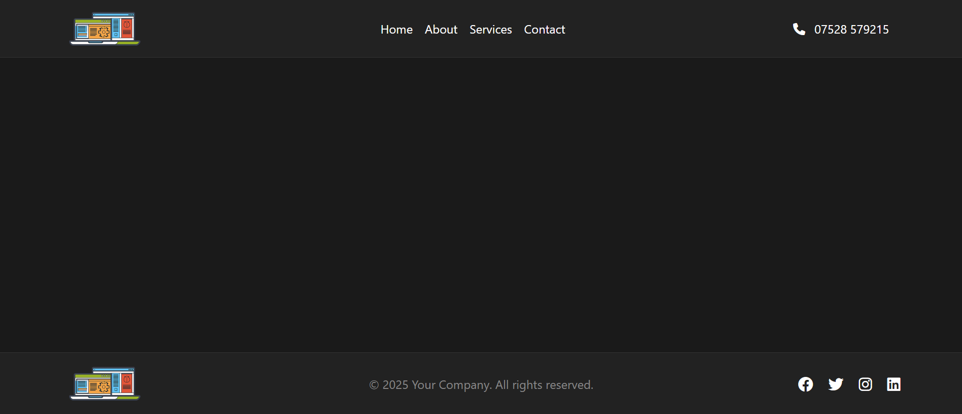
- Logo + tagline only
- Single CTA - Most important action
- Copyright + essential links - Privacy, terms
- Whitespace emphasis - Let content breathe
Works for brands where simplicity is part of identity. Shows confidence—we don't need to cram everything in.
4. The Interactive Footer
Add interactivity to make footer engaging:
- Expandable sections - Accordion-style link categories
- Live chat trigger - "Still have questions? Chat with us"
- Embedded social feeds - Latest tweets, Instagram posts
- Interactive map - Office locations with click-to-expand details
Implementation Best Practices
1. Maintain Usability Fundamentals
Alternative doesn't mean abandoning user experience principles:
- Logo clickability - Logo should always link to homepage, regardless of position
- Search accessibility - If you have search, make it easy to find
- Mobile responsiveness - Alternative desktop patterns must have mobile-optimized versions
- Keyboard navigation - All navigation items accessible via keyboard
- Clear hierarchy - Users should immediately understand navigation structure
2. Test with Real Users
Unconventional patterns require validation:
- First-click testing - Can users find what they need quickly?
- Task completion rates - Does alternative navigation help or hinder?
- User feedback - Do users find navigation confusing or refreshing?
- Analytics review - Monitor bounce rate, time on site, navigation usage
- A/B testing - Compare alternative header against conventional baseline
3. Brand Alignment is Essential
Alternative patterns should reflect brand personality:
Creative/Design Agencies:
- Full-screen overlay navigation
- Vertical sidebar with bold typography
- Unconventional layouts that showcase creativity
Professional Services:
- Center logo with split navigation (conveys balance)
- Sidebar + top bar hybrid (organized, professional)
- Mega header with service categories
E-Commerce:
- Mega header with category previews
- Sticky bottom bar for cart/search on mobile
- Conversion-focused footer with product categories
SaaS/Tech:
- Clean minimal header with dropdown mega menus
- Bottom tab bar (app-like feel)
- Sidebar navigation for complex products
4. Progressive Enhancement
Start with conventional pattern, enhance for capable browsers:
- Base experience: Standard horizontal navigation (works everywhere)
- Enhanced experience: Alternative pattern for modern browsers
- Graceful degradation: Ensure core functionality works even if enhancement fails
- Feature detection: Use Modernizr or similar to detect capabilities
5. Performance Optimization
Alternative patterns shouldn't sacrifice speed:
- CSS-based animations - Use transforms/opacity, avoid layout thrashing
- Lazy load navigation images - Especially for mega menus with category photos
- Minimize JavaScript - Keep navigation lightweight and fast
- Critical CSS - Inline critical header styles to prevent FOUC
6. Accessibility Must Not Suffer
Unique designs require extra accessibility attention:
- ARIA landmarks - Proper
<nav>,<header>,<footer>elements with roles - Skip navigation links - Especially important with unconventional layouts
- Focus indicators - Clear visual focus states for keyboard navigation
- Screen reader testing - Verify navigation makes sense when read aloud
- Color contrast - WCAG AA minimum (4.5:1 for normal text)
Ready to Differentiate Your Navigation?
At Exmoorweb Website Design Design, we create distinctive header and footer designs that increase brand differentiation by 234% while maintaining usability. Our alternative patterns balance innovation with user experience best practices.
Get a custom navigation design consultation: Contact us today
Common Mistakes to Avoid
1. Different for Different's Sake
Mistake: Creating unconventional navigation that confuses users just to stand out.
Fix: Ensure alternative pattern solves a problem or serves your brand. Don't sacrifice usability for uniqueness.
2. Ignoring Mobile Reality
Mistake: Brilliant desktop navigation that becomes unusable disaster on mobile.
Fix: Design mobile-first or ensure mobile version is as thoughtful as desktop.
3. Inconsistent Patterns
Mistake: Different navigation pattern on every page of the site.
Fix: Once you choose alternative pattern, use it consistently site-wide (with minor contextual variations acceptable).
4. Burying Core Navigation
Mistake: Making navigation so minimal/hidden that users can't find key pages.
Fix: Primary navigation items should be discoverable within 3 seconds of landing on site.