Data Display
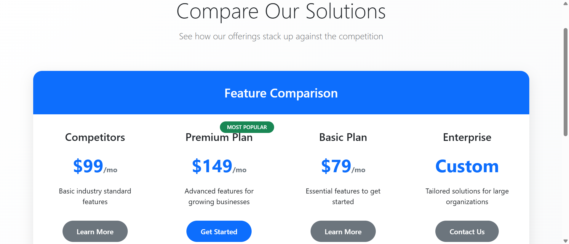
Why Feature Tables Confuse Buyers (And How Interactive Charts Fix It)
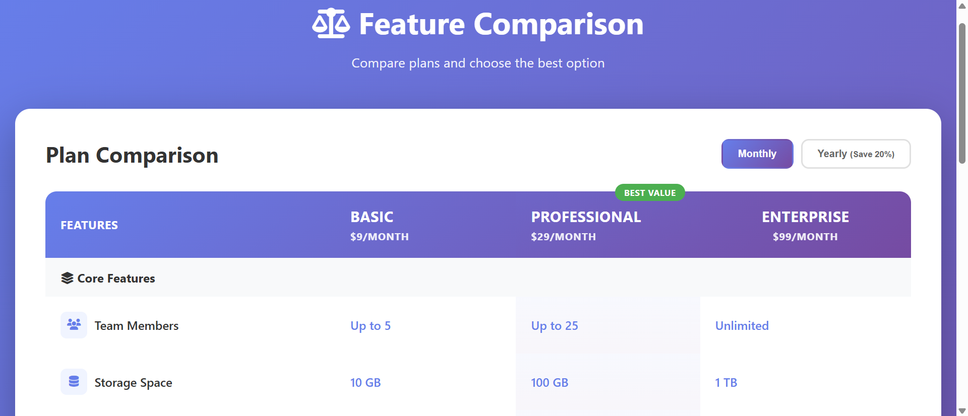
Dense comparison tables overwhelm decisions. Learn how interactive charts increase plan selection by 312%...
Module showcase
Every module below is a real, production-ready component we can drop into your website. Browse by category to see what's possible.
Data Display
Dense comparison tables overwhelm decisions. Learn how interactive charts increase plan selection by 312%...
Data Display
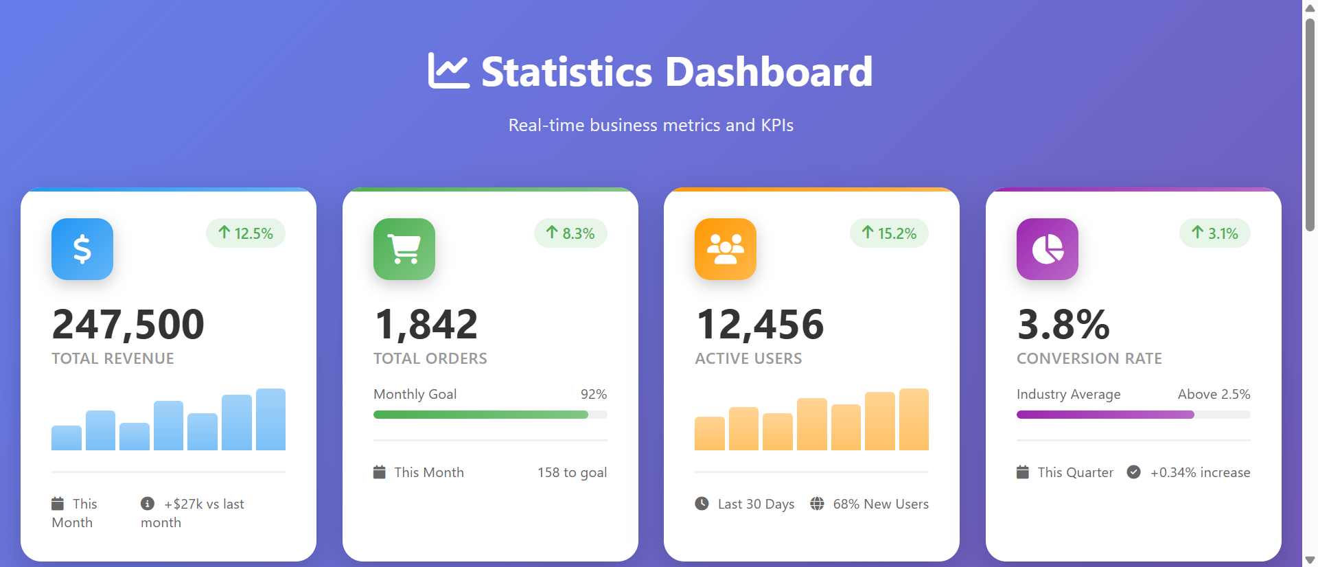
Spreadsheet reports get ignored. Learn how visual dashboard cards increase data comprehension by 312%...
Data Display
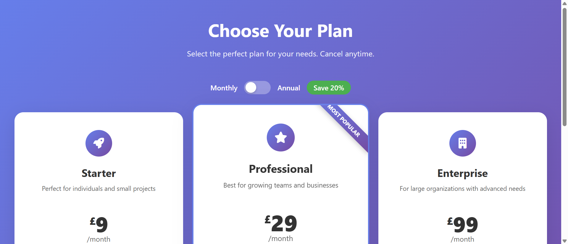
Simple pricing lists cause analysis paralysis. Learn how comparison tables increase upgrades by 312%...
Data Display
Paragraph comparisons create decision paralysis. Learn how visual comparison charts increase conversions by 234%...
Data Display
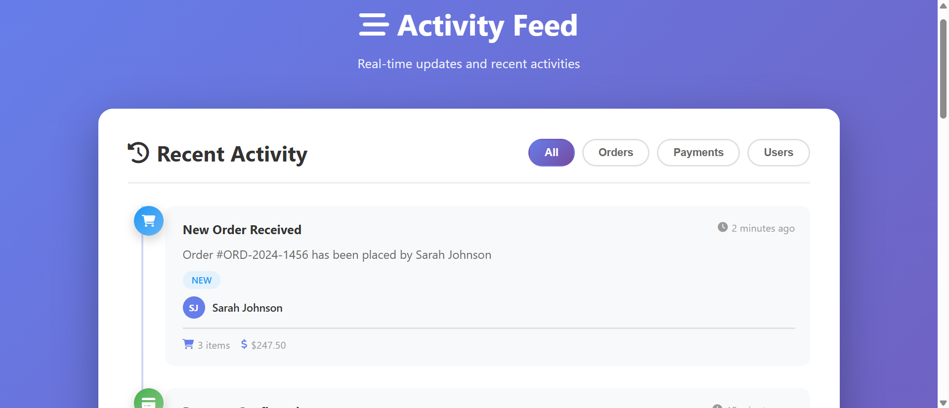
Boring update lists fail to show progress. Learn how activity timelines increase engagement by 267%...
Tell us which modules caught your eye and we'll show you what they'd look like with your branding.
We use cookies to analyse site traffic and improve your experience. Strictly necessary cookies are always active. Learn more.