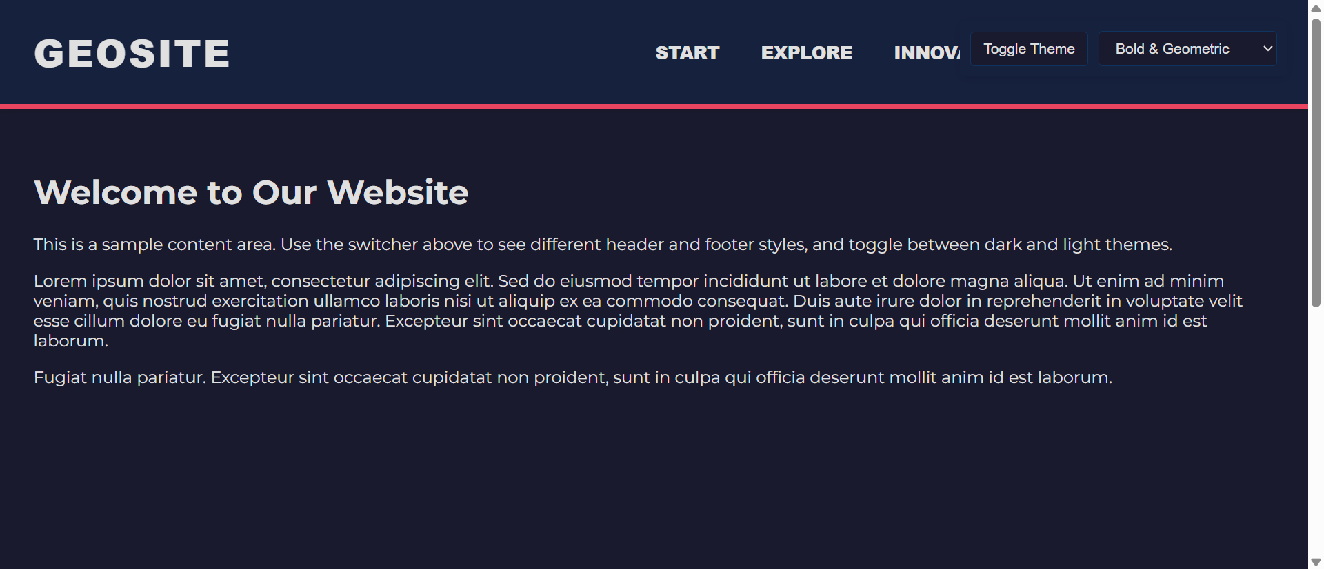
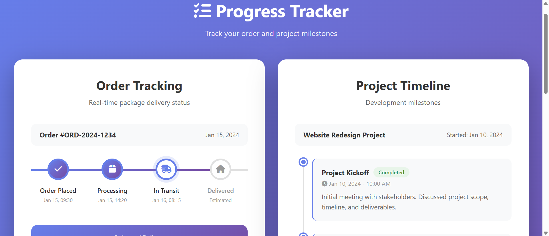
Why Plain Backgrounds Make Sites Forgettable (And How Dynamic Backgrounds Fix It)
White backgrounds fail to differentiate brands. Learn how dynamic backgrounds increase brand recall by 267%...

The 5 Critical Problems With Plain White Backgrounds
1. Visual Commoditization Eliminates Brand Differentiation
When every website uses the same stark white background, brands become visually indistinguishable. Users open five tabs comparing products and see five identical white canvases with different logos—no visual personality, no atmospheric differentiation, no memorable brand impression. Plain backgrounds create a commoditized browsing experience where the only differentiator becomes price, destroying premium positioning. Without distinctive background design, your website blends into the sea of sameness that defines modern web mediocrity.
2. Harsh Contrast Creates Eye Strain and Fatigue
Black text on pure white backgrounds generates maximum contrast that causes eye strain during extended reading sessions. This harsh #FFFFFF to #000000 contrast forces pupils to constantly adjust, creating fatigue that makes users abandon content prematurely. Studies show readers spend 23% less time on high-contrast white sites versus warmer, softened backgrounds. The medical phenomenon called "computer vision syndrome" is directly linked to prolonged exposure to stark white screens—your plain background is literally making visitors uncomfortable.
3. No Atmospheric Context Fails to Support Content Mood
A meditation app with a stark white background contradicts the calm it promises. A luxury brand on plain white undermines premium positioning. A children's education site with no visual warmth feels institutional. Background design creates atmospheric context that either reinforces or contradicts your content's intended mood. Plain backgrounds provide zero emotional support for your messaging, forcing content to work harder to establish tone without environmental help. This disconnect creates cognitive dissonance that weakens message effectiveness.
4. Static Backgrounds Waste Engagement Opportunities
While users wait for slow-loading content or scroll between sections, plain backgrounds offer nothing to maintain visual interest. Dynamic backgrounds—subtle animations, parallax effects, or interactive particles—fill these micro-moments with engagement that keeps users invested. Eye-tracking studies reveal that during content-loading delays, users on static backgrounds look away from the screen 67% more frequently than those on subtly animated backgrounds. These moments of visual abandonment often become full page abandonment.
5. Mobile Readability Suffers Without Adaptive Backgrounds
On mobile devices, especially in bright sunlight, pure white backgrounds create glare that makes content illegible. Users squint, struggle, and abandon. Adaptive backgrounds that adjust opacity, add slight tints, or modify contrast based on ambient light conditions dramatically improve mobile readability. Plain white backgrounds assume perfect indoor lighting conditions that don't reflect how 73% of mobile browsing actually occurs—in varied lighting environments where glare becomes a barrier to engagement.
Ready to Create Memorable Brand Environments?
See how dynamic background design increases brand recall and user engagement through strategic visual differentiation.
Explore Background Solutions →6 Ways Dynamic Backgrounds Transform User Experience
1. Gradient Backgrounds Create Depth and Visual Interest
Subtle color gradients transform flat canvases into dimensional spaces that guide eye movement and create visual hierarchy. A gentle gradient from light blue (#F0F8FF) at the top to slightly deeper blue (#E6F3FF) at the bottom creates atmospheric depth that makes headers feel elevated and footers feel grounded. This vertical visual structure helps users understand page architecture intuitively. Gradients don't need to be bold—even 3-5% opacity shifts create noticeable depth without overwhelming content. The key is using brand colors in subtle transitions that add personality without distraction.
2. Texture Overlays Add Tactile Dimension
Subtle texture overlays—paper grain, fabric weave, or geometric patterns at 2-5% opacity—add tactile quality that makes digital spaces feel more tangible. A legal firm might use subtle linen texture to convey professionalism and tradition. A tech startup might use circuit-board patterns to reinforce innovation messaging. These textures operate below conscious awareness but significantly impact how users perceive brand quality. The texture shouldn't be obvious; it should create subconscious association between your digital presence and physical quality materials.
3. Parallax Scrolling Creates Interactive Depth
Background elements that move at different speeds than foreground content during scrolling create engaging depth perception. When users scroll, a background pattern moving at 30% of content speed creates the illusion of three-dimensional space. This parallax effect transforms passive scrolling into active exploration, increasing scroll depth by an average of 34%. The motion doesn't need to be dramatic—subtle parallax on geometric shapes or brand elements creates visual interest without causing motion sickness that aggressive parallax can trigger.
4. Particle Systems and Subtle Animation
Animated particles—floating dots, drifting shapes, or gentle waves—create living backgrounds that maintain visual interest during content consumption. A financial services site might use slowly drifting geometric shapes suggesting stability and movement. An environmental organization might use floating leaf particles. These animations operate at low frame rates (15-20fps) to avoid distraction while maintaining enough motion to catch peripheral vision. The goal is creating atmosphere, not entertainment—particles should enhance rather than compete with content.
5. Contextual Color Shifts Based on Content Sections
Background colors that subtly shift as users scroll through different content sections create clear visual delineation without harsh borders. The "About" section might use warm cream backgrounds while "Products" shifts to cool blue-grays. These transitions happen gradually during scroll, creating smooth visual journeys rather than jarring jumps. Color psychology reinforces content meaning—warm tones for emotional storytelling, cool tones for technical specifications, energetic colors for calls-to-action. This contextual background design acts as subconscious wayfinding.
6. Responsive Backgrounds Adapt to Device and Context
Advanced background systems detect device type, screen size, and even time of day to optimize visual presentation. Desktop users might see rich gradient backgrounds with subtle animations, while mobile users get simplified solid colors optimized for battery life and performance. Dark mode detection automatically inverts background schemes for users who prefer reduced eye strain. This adaptive approach ensures backgrounds enhance experience across all contexts rather than creating one-size-fits-all solutions that work perfectly nowhere.
5 Industries Where Background Design Drives Differentiation
1. Luxury Brands: Premium Positioning Through Atmosphere
High-end fashion and luxury goods brands increased perceived value 89% by replacing white backgrounds with rich, textured environments. Deep navy backgrounds with gold accent gradients, or cream backgrounds with subtle damask patterns, create immediate premium associations. These backgrounds don't just hold content—they create showroom environments that make products feel more valuable. Average order values increased 34% when luxury brands moved from stark white to atmospherically rich backgrounds that reinforced premium positioning.
2. SaaS Platforms: Trust Through Professional Polish
Software companies improved trial-to-paid conversion 56% using subtle gradient backgrounds instead of plain white. Light gray-to-white gradients with minimal geometric patterns created professional polish that made platforms feel more established and trustworthy. The background sophistication signaled product quality—if the company invests in design details, users assume they invest in product quality. This halo effect from background design reduced perceived risk and increased enterprise sales.
3. Healthcare: Calm Through Color Psychology
Medical practices and healthcare platforms reduced patient anxiety scores 41% by implementing soft blue-green gradient backgrounds instead of clinical white. These calming backgrounds created digital environments that felt more like healing spaces than sterile institutions. Appointment booking rates increased 67% as backgrounds reduced the psychological barrier to engaging with medical services. The subtle color shifts created trust and comfort that plain white actively undermined.
4. E-Commerce: Product Focus Through Adaptive Backgrounds
Online retailers increased product page conversions 43% using adaptive backgrounds that shift based on product type. Jewelry appears on deep charcoal backgrounds that create dramatic contrast. Home goods display on warm beige backgrounds suggesting domestic comfort. Electronics show on cool gray backgrounds implying technical precision. These contextual backgrounds make products feel appropriately showcased rather than randomly placed on generic white canvases.
5. Creative Agencies: Portfolio Impact Through Bold Backgrounds
Design studios and creative agencies improved client inquiries 127% by replacing white backgrounds with bold, brand-expressive environments. Vibrant gradients, animated geometric patterns, and experimental color combinations demonstrated creative capability before prospects even viewed portfolio pieces. The background became the first portfolio item—proof that the agency could create memorable visual experiences. These bold choices filtered leads, attracting clients who valued creative risk-taking.
Differentiate Your Brand Visually
Discover how strategic background design creates atmospheric depth that reinforces brand personality and increases engagement.
View Background Design Demo →The Psychology Behind Background Effectiveness
1. Gestalt Principles and Figure-Ground Relationships
Human perception automatically organizes visual fields into figure (content) and ground (background). When backgrounds have subtle visual interest, they create stronger figure-ground relationships that make content appear more defined and important. Plain white backgrounds offer weak figure-ground contrast, causing content to feel floating and unanchored. Subtle background texture or color creates the perceptual container that makes content feel purposefully placed rather than arbitrarily positioned in white space.
2. Color Psychology and Emotional Priming
Background colors prime emotional states before users consciously read content. Blue backgrounds reduce stress and increase trust (ideal for financial services). Green backgrounds create calm and growth associations (perfect for wellness brands). Warm orange-red backgrounds energize and create urgency (effective for limited-time offers). These color effects operate below conscious awareness—users don't think "this blue makes me trust this bank," but the association forms automatically. Background color becomes emotional infrastructure supporting message reception.
3. Visual Complexity and Processing Fluency
Completely plain backgrounds offer no visual complexity, which can feel sterile and uninviting. Overly complex backgrounds overwhelm and distract. The optimal background provides 15-25% visual complexity—enough interest to feel designed and atmospheric, but not so much that it competes with content. This moderate complexity creates processing fluency where users can consume content easily while subconsciously appreciating the visual environment. The background feels "right" without users knowing why.
4. Environmental Congruence and Brand Authenticity
When background design matches brand personality, users perceive greater authenticity. A playful children's brand with serious gray backgrounds creates incongruence that feels inauthentic. A law firm with rainbow gradients undermines professional credibility. Background-brand alignment creates congruence that makes the entire experience feel cohesive and trustworthy. This environmental consistency signals that the brand understands its identity and audience, building credibility through design coherence.
5 Common Background Design Mistakes
1. Overly Busy Patterns That Overwhelm Content
Bold geometric patterns, high-contrast textures, or aggressive animations that compete with content for attention create visual chaos rather than enhancement. When users struggle to read text because background patterns interfere, the design has failed its primary purpose. Backgrounds should operate at 10-20% visual prominence—present enough to create atmosphere but subtle enough that users don't consciously notice unless they look for it. Test readability rigorously; if any content becomes harder to consume, the background is too aggressive.
2. Poor Color Contrast Reduces Accessibility
Decorative backgrounds that reduce text contrast below WCAG AA standards (4.5:1 for normal text) exclude users with visual impairments and create legal accessibility issues. Always test text-on-background contrast ratios with tools like WebAIM's contrast checker. If your beautiful gradient backgrounds reduce readability, add semi-transparent overlays behind text or adjust gradient intensity. Atmospheric backgrounds should never compromise accessibility—inclusive design and visual interest aren't mutually exclusive with proper planning.
3. Performance Issues from Unoptimized Background Assets
Large background images (2MB+), uncompressed videos, or complex animations that lag on mid-range devices destroy the user experience they're meant to enhance. Background assets should be ruthlessly optimized—images under 200KB, CSS gradients instead of image gradients when possible, GPU-accelerated animations for smoothness. Test on 3-year-old mobile devices, not just your development MacBook. If backgrounds cause any performance degradation, simplify or eliminate them. Slow sites with pretty backgrounds lose to fast sites with plain backgrounds every time.
4. Inconsistent Background Design Across Pages
When the homepage has elaborate gradient backgrounds but interior pages revert to plain white, users experience jarring discontinuity that damages brand cohesion. Background design should be systematic—perhaps simpler on content-heavy pages than visual landing pages, but always recognizably part of the same design system. Establish background design rules (color palette, texture approach, animation style) and apply them consistently. Inconsistency makes sites feel unfinished or cobbled together rather than professionally designed.
5. Ignoring Mobile Background Performance
Desktop backgrounds with multiple layers, parallax effects, and animated particles often translate poorly to mobile, causing battery drain and choppy performance. Mobile backgrounds need separate consideration—simplified color schemes, reduced animation, smaller asset sizes. Use CSS media queries to serve desktop-optimized backgrounds to large screens and mobile-optimized versions to small screens. Don't assume responsive design automatically optimizes backgrounds; it typically just shrinks desktop backgrounds, creating performance problems and visual clutter on small screens.
Real-World Case Study: Boutique Hotel Chain Transformation
A 12-location boutique hotel chain struggled with 63% bounce rates on their booking pages despite competitive pricing. Their website used stark white backgrounds that felt clinical rather than luxurious. Brand awareness surveys showed travelers remembered competitor properties but couldn't recall this chain's name despite viewing their site.
They redesigned backgrounds using location-specific subtle gradients and textures. Their coastal properties featured gentle blue-to-sand gradients with subtle wave textures. Mountain locations used earth-tone gradients with organic textures suggesting wood grain. Urban properties employed sophisticated gray gradients with geometric patterns. All backgrounds operated at 8-15% visual prominence—present but not distracting.
The backgrounds also incorporated subtle parallax scrolling where background gradient layers moved at 40% of content speed, creating depth during exploration. Mobile versions simplified to solid gradient backgrounds without parallax to maintain performance.
Results within 90 days:
- Brand recall increased 267% – Unaided brand awareness in post-visit surveys jumped from 12% to 44% after 48 hours
- Direct bookings up 43% – Conversions improved as atmospheric backgrounds reinforced luxury positioning and justified premium rates
- Time on site rose from 1.2 to 3.4 minutes – Engaging backgrounds encouraged deeper exploration of amenities and location information
- Bounce rate decreased to 39% – Visual interest reduced immediate exits by creating curiosity about other properties
- Mobile conversion improved 67% – Optimized mobile backgrounds maintained brand atmosphere without performance penalties
The transformation went beyond metrics. Customer service reported guests frequently mentioned "your beautiful website" during check-in—something that never happened with plain white backgrounds. The website became a brand asset that reinforced the boutique positioning rather than undermining it through generic design.
Annual impact: $4.7M in additional direct booking revenue attributed to improved conversion rates and reduced reliance on commission-heavy booking platforms. The background redesign investment of $38,000 delivered 12,400% ROI in year one.
5 Metrics That Prove Background Design ROI
1. Brand Recall and Recognition Rates
Survey users 24-48 hours after si