Why Minimal Footers Miss Conversion Opportunities (And How Mega Footers Fix It)
Sparse footers waste valuable screen space. Learn how comprehensive mega footers increase secondary conversions by 267%...
A visitor finishes reading your blog post and scrolls to the bottom looking for your contact information. Your footer displays: "© 2025 Company Name | Privacy Policy | Terms." That's it. No address, no phone number, no email, no social links, no sitemap. The visitor opens a new tab, searches "Your Company Name contact," finds a competitor instead, and never returns.
You didn't lose a lead because of bad content or poor products—you lost them because your minimal footer treated the bottom of the page as dead space instead of opportunity space. Meanwhile, competitors with comprehensive mega footers capture those same "finished reading, what next?" moments with organized navigation, clear contact paths, newsletter signups, and social proof.
While minimalist design trends encourage "clean" sparse footers, user behavior research shows 47% of website visitors scroll to footers specifically seeking information that primary navigation doesn't prominently display. When footers hide this information or omit it entirely, you're actively preventing conversions that users initiated themselves.
This article reveals why minimal footers sabotage user experience despite aesthetic appeal and how comprehensive mega footers transform wasted page-bottom real estate into navigation hubs, trust-builders, and conversion opportunities.
5 Critical Problems Minimal Footers Create
1. Hidden Contact Information Forces Unnecessary Searches
Research on user behavior shows 42% of visitors scroll to footers specifically seeking contact information—phone numbers, addresses, email, support links. Minimal footers displaying only copyright and legal links force these intent-rich visitors to hunt through navigation menus, About pages, or give up entirely.
Every visitor who scrolls to footer seeking contact info has already demonstrated interest: They consumed your content, want to engage further, and took action (scrolled) to find contact paths. Minimal footers reject this self-initiated interest by providing no contact options, transforming warm leads into frustrated abandoned sessions.
The Mobile Contact Crisis: Mobile users disproportionately seek footer contact information because mobile navigation is harder to use than desktop menus. Small screens make header navigation less visible; footer scrolling is effortless. When 65-75% of traffic originates on mobile devices where footer contact-seeking behavior is highest, minimal footers without contact info fail the majority of your audience at the exact moment they're trying to reach you.
2. Missing Secondary Navigation Creates Dead Ends
Visitors finishing content pieces (blog posts, product pages, case studies) often scroll to footers seeking "what else does this site offer?" Secondary navigation in footers provides discovery pathways: related content categories, resource sections, company information, product lines.
Minimal footers lacking this navigation create dead ends: Users finish reading, scroll down, find nothing actionable, and leave. Comprehensive footers extend engagement by answering "I'm interested—where should I explore next?" with organized link structures that guide continued site exploration.
3. No Trust Signals Leave Professional Questions Unanswered
Footers traditionally display trust and credibility signals: Physical addresses (proves real business), phone numbers (shows accessibility), client logos (demonstrates experience), security certifications, industry memberships, awards, and years in business.
Minimal footers omitting these elements leave credibility questions unanswered. First-time visitors finishing content wonder "Is this a legitimate business? Are they established? Where are they located?" Absence of footer trust signals doesn't read as "minimalist design"—it reads as "hiding something" or "no physical presence."
4. Missed Newsletter and Engagement Opportunities
Email newsletter signups in footers capture interested visitors who've consumed content and might want more—perfect newsletter prospect profile. Social media links enable ongoing engagement beyond single site visits. Both opportunities disappear in minimal footers.
Research shows footer newsletter signups convert 2-3X higher than popup or mid-content placements because footer positioning targets visitors who've already engaged with content and proven interest. Minimal footers abandon these high-intent conversion opportunities in pursuit of aesthetic simplicity.
5. Poor SEO and Information Architecture
Comprehensive footers improve SEO through internal linking, keyword-rich anchor text, and clear site structure signals to search engines. They help search crawlers understand site organization, discover deep pages, and recognize topical authority.
Minimal footers provide none of this SEO value. Three links ("Privacy," "Terms," "Copyright") don't help search engines understand your site structure or content depth. Meanwhile, competitor mega footers with 40+ organized links signal comprehensive content libraries and topical expertise that search algorithms reward with higher rankings.
6 Solutions Comprehensive Mega Footers Deliver
1. Multi-Column Organization with Clear Information Hierarchy
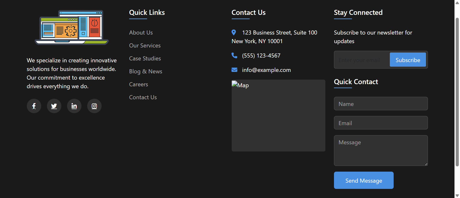
Mega footers use 3-5 column layouts organizing information into logical categories: Company (About, Careers, Press), Products/Services, Resources (Blog, Guides, FAQs), Support (Contact, Help Center, Documentation), and Legal (Privacy, Terms, Accessibility).
This organization makes information findable through visual scanning rather than requiring menu navigation or search. Users seeking contact info know to check "Support" column; investors look in "Company" section; customers explore "Products" column. Structured organization respects user mental models about where information should live.
The Amazon Footer Standard: Amazon's mega footer sets user expectations: Multi-column organization, comprehensive links, contact information, social media, newsletter signup, trust badges. When category-leading sites establish patterns, users expect all sites to follow them. Your minimal footer doesn't feel "clean and modern"—it feels "incomplete and unprofessional" compared to the mega footer standard Amazon trained users to expect.
2. Complete Contact Information with Multiple Channels
Comprehensive footers display full contact details: Physical address with map link, phone number with click-to-call (mobile), email address, contact form link, live chat access, and support hours. Multiple contact channels accommodate different user preferences and urgency levels.
This accessibility signals transparency and customer-service commitment. Businesses hiding contact information appear evasive; businesses displaying prominent footer contact info signal "we're here, we're real, we want to hear from you." The psychological impact extends beyond immediate contact needs—it builds trust even for users not currently contacting you.
3. Newsletter Signup with Value Proposition
Mega footers include newsletter subscription forms with clear value propositions: "Get weekly marketing tips," "Exclusive product updates," "Industry insights delivered monthly." This targeted messaging converts interested content consumers into ongoing email subscribers.
Footer newsletter placements work because positioning targets high-intent visitors: They scrolled through entire content pieces, demonstrated engagement, and naturally arrived at footer seeking next steps. Newsletter signup provides that next step, converting one-time visitors into recurring audience members.
4. Social Media Integration and Community Links
Comprehensive footers display social media icons linking to business profiles on relevant platforms (LinkedIn, Twitter, Facebook, Instagram, YouTube). This social proof shows active community engagement and provides alternative engagement channels beyond the website.
Social links extend brand presence beyond owned properties. Visitors might not revisit your website weekly, but they'll see your LinkedIn posts in their feeds or YouTube videos in recommendations—maintaining brand awareness and engagement through social algorithm distribution your website alone can't achieve.
5. Trust Elements: Certifications, Awards, Client Logos
Mega footers include credibility signals: Security certifications (SSL badges, PCI compliance), industry memberships, awards, "As Seen In" media logos, client testimonial counts, or years in business. These trust elements reassure visitors about business legitimacy and expertise.
This social proof particularly benefits B2B sites, e-commerce, and professional services where trust directly impacts conversion. Seeing "ISO 9001 Certified" or "Featured in Forbes" in footer reassures prospects that previous customers, certifying bodies, and media outlets have validated your business—reducing perceived risk of engagement.
6. Comprehensive Site Navigation and Sitemap
Mega footers function as HTML sitemaps, displaying primary and secondary page links in organized categories. This navigation serves multiple purposes: Helps lost users find pages, assists search engine crawlers discovering content, and provides overview of site structure and offerings.
Users who can't find information via search or header navigation often scroll to footer as last resort before leaving. Comprehensive footer navigation catches these near-abandonment moments, providing alternative path to desired information. Footer links prevent exits by answering "maybe it's down here" user behavior.
See Comprehensive Mega Footer Design
Discover how multi-column organized footers transform page bottoms into navigation hubs and conversion opportunities.
Explore Footer Demo →5 Industries Maximizing Footer Value with Mega Footer Designs
1. E-Commerce and Retail
Online stores use mega footers displaying product categories, customer service links (shipping, returns, FAQs), trust badges (secure checkout, verified reviews), newsletter signup, social media, and live chat access—providing comprehensive shopping support.
Result: Footer engagement increases secondary page views by 34% as shoppers discover additional product categories, and customer support ticket volume decreases 28% as footer FAQs/policies answer common questions preventing support requests.
2. SaaS and Technology Companies
Software companies display mega footers with product links, documentation, API references, developer resources, integration partners, status pages, security compliance certifications, and contact options—serving technical users seeking specific information.
Result: Developer documentation discovery improves 156% when comprehensive footer links surface API docs, SDKs, and integration guides, reducing onboarding friction and support burden for technical self-service users.
3. Media and Publishing
News sites and content publishers use mega footers organizing content by topic categories, author pages, archive access, newsletter subscriptions, social media, advertising information, and editorial policies—facilitating content discovery.
Result: Pages per session increase 43% when footer navigation enables topic-based browsing, and email subscriber conversion improves 89% through footer newsletter signup positioned to capture engaged readers.
4. Professional Services and B2B
Consulting firms, agencies, and B2B service providers display mega footers with service offerings, industry expertise, case studies, thought leadership content, certification badges, office locations, and multi-channel contact options.
Result: Lead qualification improves as prospects self-educate through footer resource links, and contact conversion increases 67% when multiple contact channels (phone, email, form, chat) accommodate different communication preferences.
5. Educational Institutions
Universities and schools use mega footers organizing information for multiple audiences: prospective students (programs, admissions), current students (portal, resources), alumni (events, giving), and parents (financial aid, campus info).
Result: Audience-specific navigation reduces bounce rates 41% as visitors find relevant information quickly, and contact channel usage diversifies with 52% increase in chat/email inquiries beyond traditional phone calls.
4 Psychology Principles Behind Mega Footer Effectiveness
1. The F-Pattern Eye Tracking Behavior
Eye-tracking research shows users scan web pages in F-pattern: Horizontal movement at top (header), vertical scan down left side, horizontal movement at bottom (footer). This natural scanning pattern makes footer positioning highly visible—contradicting assumptions that "footer = ignored."
Comprehensive footers leverage this natural eye movement pattern by placing valuable information where eyes naturally land after content consumption. Users don't consciously decide to "check footer"—their eyes automatically scan there as final page area, making footer content passively discoverable through natural reading patterns.
2. Choice Architecture and Decision Fatigue
Behavioral economics research shows people facing decisions value having options without being overwhelmed. Mega footers provide organized choices (40-60 links in categorized columns) that feel manageable because structure reduces cognitive load.
Paradoxically, more options (organized well) convert better than fewer options (organized poorly). Three random links in minimal footer force users to search elsewhere; 50 organized links in mega footer enable self-service discovery. Structure transforms quantity from overwhelming to empowering.
3. The Reciprocity Principle: Giving Before Asking
Robert Cialdini's reciprocity research shows people feel obligated to return favors. Comprehensive footers provide value (information, resources, navigation) before asking for commitment (newsletter signup, contact, purchase).
Newsletter signups in mega footers convert 2-3X higher than popup interruptions because positioning demonstrates reciprocity: "We gave you valuable content, organized navigation, useful resources—if you'd like more, here's newsletter signup." This respectful ask-after-value-delivery feels collaborative, not extractive.
4. The Peak-End Rule: Last Impressions Matter
Psychological research by Daniel Kahneman shows people judge experiences largely on peak moments and endings. Footer is literally the last thing visitors see—making it disproportionately influential in overall site impression formation.
Minimal footers create negative ending impressions: "That's it? Just copyright and legal links?" Comprehensive mega footers create positive endings: "Wow, they really organize information well. Professional. Helpful. Transparent." This final impression colors entire site evaluation, influencing trust and return likelihood.
5 Mistakes That Sabotage Mega Footer Implementations
1. Overwhelming Clutter Without Clear Organization
Dumping 100+ random links in footer without categorization, visual hierarchy, or spacing. Result: Cluttered unusable footer that's worse than minimal footer—users can't find anything in the chaos.
Solution: Limit to 3-5 main columns, 5-8 links per column maximum, clear category headers, generous white space, and logical grouping. Organization matters more than quantity. Well-organized 40 links beats randomly-dumped 20 links.
2. Tiny Unreadable Text and Links
Footer text at 10px or smaller, light gray on gray backgrounds, 8px line height cramming links together. Mobile users can't read it; desktop users strain to read it; nobody uses it.
Solution: Minimum 14px font size for footer text, 16px for links, high contrast (dark text on light background or vice versa), 1.6-1.8 line height for readability. Footer content must be as readable as body content—reducing size doesn't make it "less important."
3. Outdated Information That Erodes Trust
Footer displaying "© 2022" three years later, disconnected phone numbers, old addresses, broken social media links, or defunct newsletter signup forms. Outdated footers signal neglect and unprofessionalism.
Solution: Implement footer content management system allowing easy updates, use dynamic copyright year (), quarterly footer audits checking link validity, and automated broken link detection. Current footer = current business; outdated footer = abandoned business.
4. No Mobile Optimization
Desktop 4-column footer that stacks into unreadable mobile tower requiring 10+ screens of scrolling. Accordion/collapsible columns ignored. Result: Mobile users (70% of traffic) never use footer.
Solution: Mobile-first footer design: Collapsible accordion sections (tap "Company" to expand company links), single-column stacking with clear sections, larger touch targets (44×44px minimum), and priority information (contact, social) displayed first.
5. Forgetting Footer Purpose: Information Not Sales Pitch
Footer filled with marketing copy, promotional banners, and sales messages instead of useful navigation and information. Users seeking contact info or sitemaps close tab in frustration.
Solution: Footer serves utility function: Navigation, contact, legal, resources, social. Save marketing for body content. One newsletter CTA acceptable; turning entire footer into sales pitch defeats purpose. Utility first, conversion second.
Real-World Case Study: SaaS Company's Footer Transformation
A project management SaaS platform with minimal footer (copyright, privacy, terms—three links total) suffered from high support volume and poor content discovery despite comprehensive help documentation and resource library.
The Problem: Analytics showed 34% of visitors scrolled to footer, but bounce rate from footer was 87%—visitors scrolled to bottom, found nothing useful, and left. Support tickets frequently asked "where is your documentation?" and "how do I contact support?" despite both being prominently linked in help center buried in navigation menu.
The Analysis: User behavior research revealed:
- Users finishing blog posts scrolled to footer seeking related resources or next articles
- Mobile users (71% of traffic) relied on footer for contact info because mobile header lacked visible contact links
- Developers sought API documentation, SDK downloads, and integration guides via footer "Resources" section