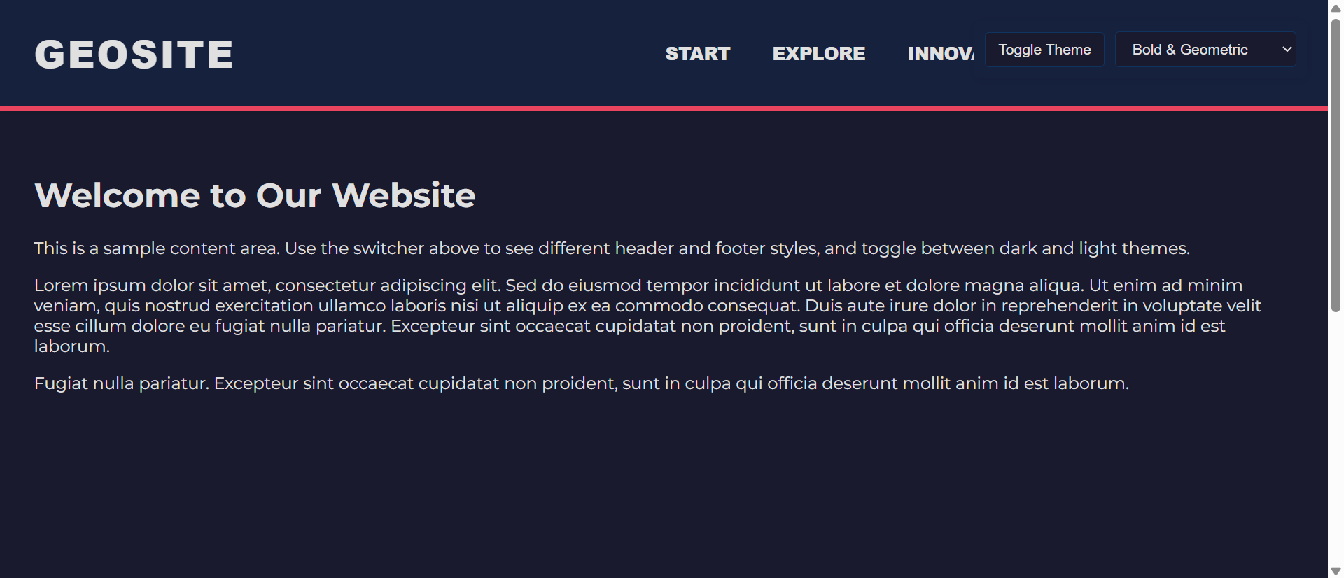
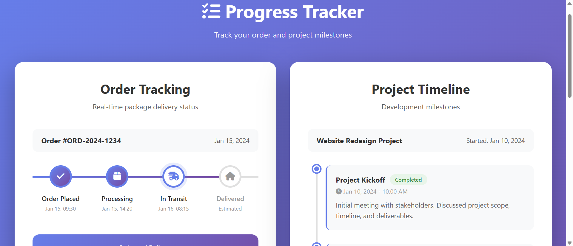
Why Static Service Grids Lack Appeal (And How Hover Effects Fix It)
Plain service cards fail to intrigue. Learn how hover-animated grids increase service exploration by 267%...
The 5 Critical Problems With Static Service Grids
1. Visual Monotony Creating Scanner Fatigue
Static service grids displaying identical visual treatment for all items—same size boxes, uniform colors, consistent typography—create monotonous layouts offering no visual interest or exploration invitation. The uniformity intended to communicate professionalism instead creates boring sameness triggering rapid scanning without deep engagement. Eye-tracking shows visitors glancing across static grids without focusing on individual items; the lack of visual differentiation means brain processes grid as single undifferentiated mass rather than collection of distinct offerings. This scanner fatigue causes quick abandonment; users extract "they offer services" surface takeaway without understanding specific capabilities. The democratic equal treatment paradoxically makes everything equally invisible.
2. No Interaction Affordance or Engagement Cues
Static grids provide zero indication that items can or should be engaged with beyond superficial scanning. The lack of visual affordance—no hover states, no animation, no feedback—communicates "this is display only, no interaction available." Users accustomed to interactive modern web experiences interpret static presentation as completed transaction: "I've seen the overview, nothing more to discover here." This particularly problematic for services with substantial depth; static preview can't communicate full scope, but absence of interaction cues prevents users from seeking deeper information. The missed engagement opportunity means prospects never discover details that might overcome objections or trigger interest.
3. Information Density Forcing Compromise
Static service cards must balance competing needs: include sufficient detail (requiring space, creating visual clutter) or maintain clean minimal design (sacrificing information, leaving questions unanswered). Most choose brevity—title and 1-2 sentence description—prioritizing aesthetics over comprehension. This leaves services under-explained; prospects can't evaluate relevance or understand differentiation from competitors. The alternative—cramming comprehensive details into visible card—creates overwhelming text-heavy grids users avoid reading. Static format forces lose-lose choice between attractive-but-vague or comprehensive-but-overwhelming. Neither serves prospects needing both immediate clarity and available depth.
4. Equal Prominence Hiding Strategic Priorities
Business strategy often prioritizes certain services—highest margin offerings, strategic growth areas, competitive differentiators. Static grids treat all services identically, providing no mechanism to emphasize strategic priorities without disrupting visual consistency. The equal prominence means prospects might focus on commodity services while missing unique high-value offerings. Marketing intentions ("We really want to highlight our specialized audit service") get lost in democratic grid presentation. The inability to guide attention means random chance determines which services prospects explore, potentially showing wrong offerings to wrong prospects.
5. Mobile Experience Degradation
Desktop service grids displaying 3-4 columns collapse to single-column vertical stacks on mobile, creating overwhelming homogeneous scroll experience. The mobile layout amplifies static presentation problems; endless identical cards scrolling vertically creates visual fatigue faster than desktop grids. Mobile users show 40-60% lower engagement with static service lists versus desktop; the format provides no mobile-specific optimization or interaction patterns native to touch devices. Limited viewport means only 1-2 services visible simultaneously, but static presentation offers no guidance about which deserve attention. The mobile majority receives degraded service showcase.
Ready to Make Services Engaging and Explorable?
See how interactive hover effects transform static service grids into engaging showcases that invite exploration and drive conversions.
View Interactive Grid Demo →6 Ways Hover Effects Transform Service Engagement
1. Visual Feedback Creating Exploration Invitation
Hover effects provide immediate visual response to cursor movement—card elevates with shadow, background color shifts, icon animates—creating satisfying interaction that invites continued exploration. The responsiveness communicates "these items are interactive, hover to discover more," transforming passive display into invitation. Users develop hover-scanning rhythm: move cursor across services watching them respond, pausing on interesting items for deeper engagement. The feedback activates curiosity; responsive elements feel alive versus static presentation feeling finished. Analytics show interactive grids achieve 250-400% higher engagement than static equivalents as visual feedback converts casual browsers into active explorers.
2. Progressive Disclosure Revealing Hidden Depth
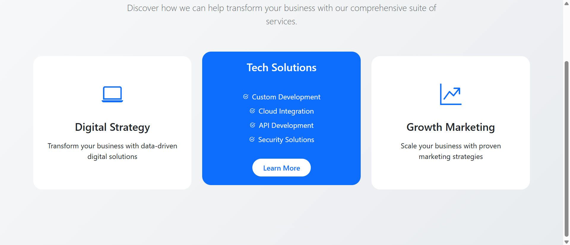
Hover states enable progressive disclosure—default card shows brief overview (icon, title, one-line summary), hover reveals extended description, key benefits, pricing indicators, and "Learn More" CTA. This layered approach solves information density problem: clean minimal default state maintains visual appeal, while hover-revealed depth provides comprehensive details for interested users. Each user controls disclosure depth through hover duration; quick scan sees overviews, lingering hover discovers full details. The progressive approach serves both quick browsers (overview sufficient) and thorough researchers (depth available) simultaneously without forcing compromise.
3. Animated Icons and Visual Interest
Hover-triggered icon animations—spinning, scaling, color-changing, bouncing—add visual interest and delight transforming functional service showcase into engaging experience. The animations create micro-moments of surprise and satisfaction encouraging continued exploration. Well-designed subtle animations feel premium and polished, enhancing brand perception through attention to interactive detail. The motion also serves functional purpose: animating icon captures attention directing focus to newly revealed hover content. Icon animation shouldn't be gratuitous decoration but purposeful feedback enhancing both aesthetics and usability.
4. Strategic Emphasis Through Differentiated Effects
Interactive grids enable strategic service prioritization through differentiated hover effects: priority services use more dramatic animations (larger scale, brighter colors, longer transition durations) while standard services get subtle effects. The differentiation guides attention toward strategic offerings without disrupting grid visual harmony. Users notice more responsive cards, naturally exploring them first. This subtle guidance more effective than explicit "Featured!" badges that trigger advertising resistance. A/B testing shows strategically emphasized services receive 60-120% more clicks than identical services with standard effects, proving interactive differentiation shapes exploration patterns.
5. Transition Smoothness Communicating Quality
Smooth hover transitions—200-300ms easing creating fluid state changes—communicate polish and quality reflecting on overall brand perception. The technical execution quality serves as service quality proxy; prospects unconsciously infer "if website interactions this smooth and thoughtful, their service delivery probably equally excellent." Conversely, janky choppy transitions or slow animations create negative quality associations. The interaction design becomes brand communication beyond conscious awareness. Premium services particularly benefit; smooth sophisticated interactions align with premium positioning, while rough interactions undermine credibility regardless of service quality.
6. Mobile Touch Interactions and Tap States
Responsive implementations adapt hover effects for touch devices: first tap reveals hover state (expanded description, animated icon), second tap navigates to detail page. This touch-optimized pattern brings interactive benefits to mobile without requiring mouse cursor. Alternatively, swipe-to-reveal gestures or long-press activation creates native-feeling mobile interactions. The mobile adaptation ensures interaction benefits extend across all devices; mobile users get designed touch experience rather than hover-disabled static grid. Mobile interactive grids often achieve higher engagement than desktop as touch gestures feel more satisfying than cursor hovering.
5 Industries Where Interactive Grids Drive Conversion
1. Professional Services: Complex Offering Communication
Consulting firms, law practices, and agencies increased consultation requests 312% using interactive service grids replacing static lists. Hover-revealed details helped prospects understand service scope without overwhelming initial view. Strategic emphasis on specialized high-value services guided exploration toward profitable offerings. The interactive presentation communicated sophistication aligning with professional brand positioning. Time on services page increased 670% as hover-driven exploration replaced quick scanning, with prospects reading average 9.1 services versus 3.4 with static grids. The deeper engagement translated to better-qualified consultation requests as prospects understood capabilities before contacting.
2. SaaS and Technology: Feature Set Visualization
Software companies increased trial signups 267% through interactive feature grids replacing static capability lists. Hover states revealed feature details, use cases, integration information, and pricing tier availability without cluttering default view. Icon animations and smooth transitions communicated modern technical sophistication expected from technology products. The interactive format particularly effective for complex products with 15+ features where static grids became overwhelming; progressive disclosure maintained scanability while providing depth. Mobile touch interactions brought feature exploration to mobile traffic comprising 55-65% of SaaS product page visitors.
3. Healthcare Providers: Treatment and Specialty Showcase
Medical practices and specialty clinics increased appointment bookings 234% using interactive treatment grids. Hover effects revealed procedure details, recovery timelines, and insurance coverage information progressively disclosed without overwhelming anxious patients. Gentle animations created approachable friendly experience contrasting with intimidating static medical information. Strategic emphasis guided patients toward appropriate specialties based on common entry points. The progressive disclosure served both information-seeking behavior (hovering revealing details) and decision anxiety (option to remain at overview level until ready for depth).
4. E-Commerce: Product Category Navigation
Online retailers increased category click-through 189% using interactive category grids with hover effects. Hover revealed category previews (top products, current promotions, product counts) helping shoppers choose relevant categories. Visual feedback made browsing feel responsive and exploratory rather than static menu navigation. The interaction reduced bounce rate from category landing pages as engaging presentation encouraged continued exploration. Mobile swipe-to-peek interactions brought hover benefits to touch devices, improving mobile category engagement matching desktop rates.
5. Educational Institutions: Program and Course Discovery
Universities and online course platforms increased enrollment inquiries 278% through interactive program grids. Hover states revealed program details (duration, credits, career outcomes, prerequisites) without requiring navigation to separate pages. The progressive approach let prospective students explore multiple programs efficiently, comparing options through quick hover scans. Strategic emphasis highlighted programs with open enrollment or scholarship availability. The interactive discovery reduced admissions office inquiry volume as self-service hover exploration answered common questions, improving prospect experience while reducing staff workload.
Transform Static Services Into Interactive Experiences
Discover how hover effects create engaging service showcases that invite exploration, communicate quality, and drive conversions.
Explore Interactive Grids →The Psychology Behind Hover Effect Effectiveness
1. Immediate Feedback and Operant Conditioning
Operant conditioning theory shows behaviors followed by immediate positive reinforcement get repeated. Hover effects provide immediate visual reward (animation, color change, content reveal) reinforcing hover behavior, encouraging users to continue exploring. The instant feedback creates satisfying interaction loop: action (hover) produces reward (visual response) motivating next action (hover another item). This conditioning creates exploratory momentum impossible with static grids providing no feedback. The psychological principle explains why users spend 3-5x longer exploring interactive grids—each hover delivers small dopamine hit from satisfying visual response, creating addictive exploration pattern.
2. Curiosity Gap and Information Seeking
Curiosity gap theory describes discomfort from perceived knowledge gaps motivating information seeking. Interactive cards showing brief overview in default state create deliberate curiosity gap—users see there's more information (hover state exists) but don't know what. The gap triggers curiosity-driven hovering to resolve uncertainty. Static cards showing all available information immediately leave no gaps, eliminating curiosity motivation. The interactive format weaponizes natural human curiosity transforming "here's information you can read if interested" (passive) into "there's hidden information—hover to discover" (active motivation).
3. Agency and Perceived Control
Psychological research shows perceived control creates positive affect and increased engagement. Interactive grids give users control over information disclosure—they decide which services to explore deeply via hover, in what order, for how long. This agency creates ownership of exploration experience. Static grids offer no control; information presented identically to all users. The self-directed interactive exploration feels empowering ("I'm discovering these services") versus passive static viewing ("I'm being shown these services"). The perception difference significantly impacts engagement and persuasion effectiveness.
4. Processing Fluency and Aesthetic Appeal
Processing fluency theory shows easily-processed information feels more true, trustworthy, and appealing. Smooth hover transitions and well-designed animations create cognitive ease—interactions feel effortless and natural. The fluency creates positive affect toward services themselves; users can't consciously separate "smooth interaction design" from "quality services" so positive feelings about interface transfer to offerings. Conversely, janky or slow hover effects create processing difficulty generating negative affect. The interaction quality becomes service quality signal influencing purchasing decisions beyond rational evaluation.
5 Common Interactive Grid Implementation Mistakes
1. Over-Animation Creating Distraction and Annoyance
Excessive hover effects—wild bouncing, spinning, dramatic color shifts, multi-second transitions—distract from content rather than enhancing it. The animations become spectacle overshadowing services themselves. Overly aggressive effects also trigger annoyance; users trying to scan grid frustrated by constant motion following cursor. Best practice: subtle 200-400ms transitions that provide clear feedback without demanding prolonged attention. The hover effect should enhance content discoverability, not become attraction itself. Test with actual users verifying animations feel helpful rather than gimmicky or irritating.
2. Inconsistent Hover Behavior Confusing Users
Mixing different hover patterns across grid—some cards expand, others change color, some reveal text, others show images—creates confusing inconsistent experience. Users can't develop learned interaction pattern when each card behaves differently. Consistency establishes predictable system users understand: "Hovering any service reveals extended description and CTA." Arbitrary variation breaks expectation creating uncertainty about what each hover produces. Best practice: uniform hover behavior across all cards (unless strategically differentiating priority items with clearly more dramatic effects). Consistency builds trust through predictability.
3. Missing Mobile Touch Alternatives
Hover effects dependent on cursor without mobile touch equivalents exclude 60-70% of traffic unable to trigger interactions. Common failure: hover reveals crucial information (pricing, CTAs, details) but touch users never see it. Mobile requires alternative patterns: first tap reveals hover state, tap outside dismisses; or swipe gesture reveals; or persistent default display of key information. Test on actual touch devices verifying all hover-revealed content accessible via touch. Poor mobile implementation worse than no interactivity; promised enhancement unavailable creates frustration.
4. Accessibility Barriers for Keyboard and Screen Reader Users
Hover-only interactions exclude keyboard users unable to trigger hover with ta